Christmas Homework
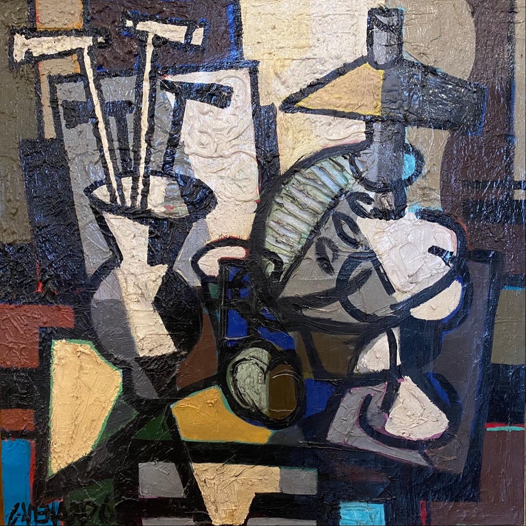
Jan Groover
|
Jan Groover in the late 1970s created her famous 'kitchen still life'. She transfered ordinary objects into subjects of beauty that hold a visual meaning more than their normal use. we took this idea and attempted it by ourselves
|

|

|
My response


Best Edits
WWW: I edited the first few pictures in a good and creative manner, and took many angles and combination of normal kitchen items in an appealing way. I also used reflections in a subtle but interesting manner
EBI: Could have gotten better lighting and better stability (lower shutterspeed)
EBI: Could have gotten better lighting and better stability (lower shutterspeed)
Form Over Function
The goal for this task was to take an ordinary kitchen utensil and turn it into something more than it's basic use in the kitchen, giving life to a geometrically simple object and bringing an appeal that makes it worth looking at.
André Kertész
André Kertész
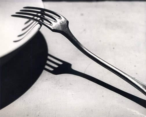
Fork - 1928 |
André Kertész created the image fork in 1928. At the time he had been living in Paris for a year, recently moved from Hungary, where he was born. He mixed with artists from the Dada movement which influenced his work towards their ideas. The image is deliberately simple, more paying attention to the photograph's composition and emphasising the fork's geometry and form, evolving the fork from a kitchen utensil. He believed photography should be about revealing the real nature of things.
Whilst in Paris, André felt like an outsider. This loneliness was expressed through the subject of his photographs, being able to combine formal composition with an emotive charge. Henri Cartier Bresson said "Each time Kertész's shutter clicks I hear his heart beating." Bresson meant that André Kertész put his whole heart into any picture he took, they were an extension of himself, and any picture linked to him through emotional and artistic means. |
My response
Best Edits


WWW: A set of good, well thought out, creative images with individual ideas whilst still keeping the simple idea of kitchen items that the original photographer creates
EBI: Focus could be better on a few of the pictures, and could include more of the flashlight beam
EBI: Focus could be better on a few of the pictures, and could include more of the flashlight beam
Set 2
In these images I took more inspiration from Kertész, redoing those that I originally took blurred, and being more deliberate with the shadows, like I planned to with my EBI
Best Edits 2
In this set we tried to work on our EBIs and get closer to Kertész work: "Fork"


WWW: I accomplished my goal of using focus better and managed to include more with the beam of light, I believe these are much closer to Kertész work than the previous set
EBI: Take a larger amount of the photo so I have more creative flexibility in photoshop to crop what I'd like
EBI: Take a larger amount of the photo so I have more creative flexibility in photoshop to crop what I'd like
Ordinary to Extra-Ordinary
Edward Weston

Edward Weston used a graflex 4 x 5 negative camera and he used this because it allowed him to see his subject matter in the right format before actually taking the photo. His philosophy was to make his own photographic language, he didn't want to follow someone's existing rules and brought beauty to ordinary objects, and as an extension of this he was very specific to what was in his frame. But, he ran into some problems during his photographing, due to his massive exposure time, there would often be a truck or car that passed by it would rock his whole house and he would have to restart the whole photograph. The surprising thing about his work was that he used an apature of 240, which is about the size of a pinprick, another unusual thing is that he used natural light, where at the time a lot of photographers were starting to use artificial light more.
First response: Natural Light
In this task we tried to imitate Weston's work where he turned an ordinary pepper into something more. We had natural sunlight from the windows on one side and white and black card as background, we then went around the different vegetables and took many angles and pictures.
Best Edits
WWW: I managed to get many well focused pictures with interesting angles. I also managed to get good sunlight angles which was the task's focus. I also managed the exposure well and avoided blur with a well decided shutter speed. I think all in all, I managed to imitate Weston's work well. The edits also had creative ideas from Weston's work and I attempted to make it look similar
EBI: Some of the image concepts were off and a few had too much background showing, some had wrong angles and I could definitely improve on thinking more before taking a picture
EBI: Some of the image concepts were off and a few had too much background showing, some had wrong angles and I could definitely improve on thinking more before taking a picture
Second Response: Artificial light
In the first set we used natural light and for this second lot of pictures we set up artificial light and we got quite a different result, we managed to get different angles with light and had more creative freedom with angles. we also tried to under-expose the pictures to give the illusion of the object imaging from the darkness
Best edits

|

|
|
WWW: I managed to get only one object in the composition, and the ones that were good showed all the aspects of his pictures and after a few attempts managed to adjust the focus properly, I also edited it so it gave the illusion of coming out of the darkness effectively
EBI: better focus in general, in a few of the pictures I could have moved some of the objects away so that the object I wanted was the only thing in the photo.
EBI: better focus in general, in a few of the pictures I could have moved some of the objects away so that the object I wanted was the only thing in the photo.
Suzanne Saroff
|
Suzanne Saroff creates images through glasses of water, breaking, flipping and distorting the subject to create a certain supernatural effect that appeals to the viewer. She often uses common foods as her subject and through this links to our topic of ordinary to extraordinary.
|
|
|

|
My response
Best Edits


WWW: I interpreted Suzanne Saroff's work well with the idea of refraction used to make an image look interesting and distorted
EBI: Could have improved focus on a few of the images, still struggling with manual focus, and could have included less of the background in some of the pictures
EBI: Could have improved focus on a few of the images, still struggling with manual focus, and could have included less of the background in some of the pictures
Homework
I responded to Andre Kertesz and Suzanne Saroff because I found their work interesting and I thought I could effectively translate their work into my own at home.
Andre Kertesz:


Best Edits

|

|
Suzanne Saroff :


Best edits

WWW: I managed to get a number of inspired images with cutlery and got the angles and subject right
EBI: Could have had better lighting and possibly better backdrop
EBI: Could have had better lighting and possibly better backdrop
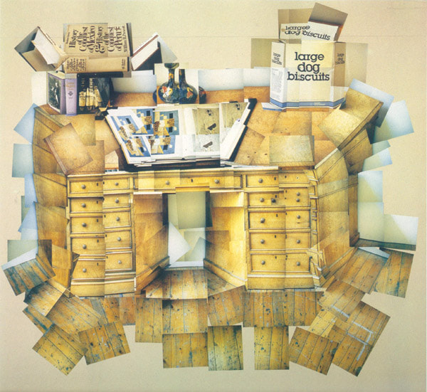
David Hockney
|
David Hockney was a photographer in the late 1900s who was heavily involved in the pop-art movement. This movement shunned the new ideas of abstractism and focused on what was popular, what was in real life in life. David Hockney took inspiration from Pablo Picasso's cubist ideas, he tried to make it realistic, bringing you closer to the image and not pushing you away as he claims other photographers do. He also tried to make it all seem like the same moment, but many different focuses, similar to the human eye quickly flicking from point to point, all in mere seconds. He achieved this goal through many close ups of different areas of the picture, and combining them, making it see how you would actually see the world, focusing on one thing at a time, and making important things bigger.
|

|
|
|
The cubist image on the left has fragments of colours and objects, looking very abstract and odd. Whereas, the joiner on the right is less abstract, looking normal but still unusual, unique. Hockney's image includes many angles but keeps the basic shapes and colours, simply giving more view, instead of a skewed view as Picasso did.
Photojoiners we will be inspired by in following projects:
|
|
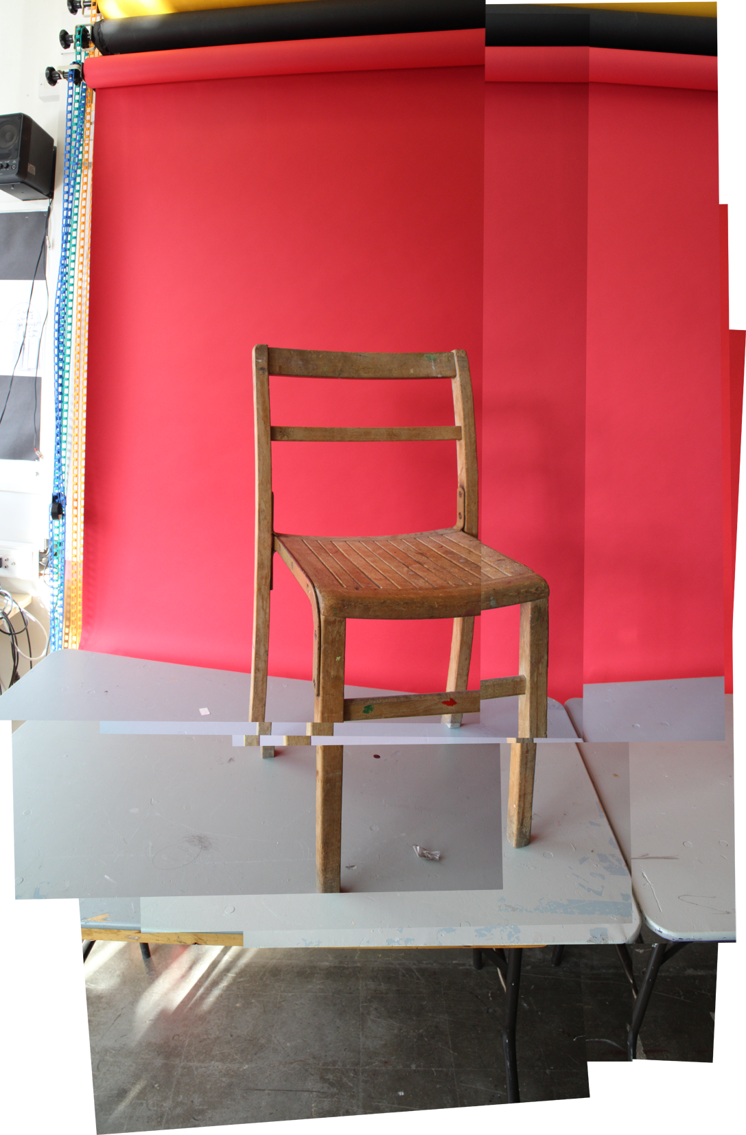
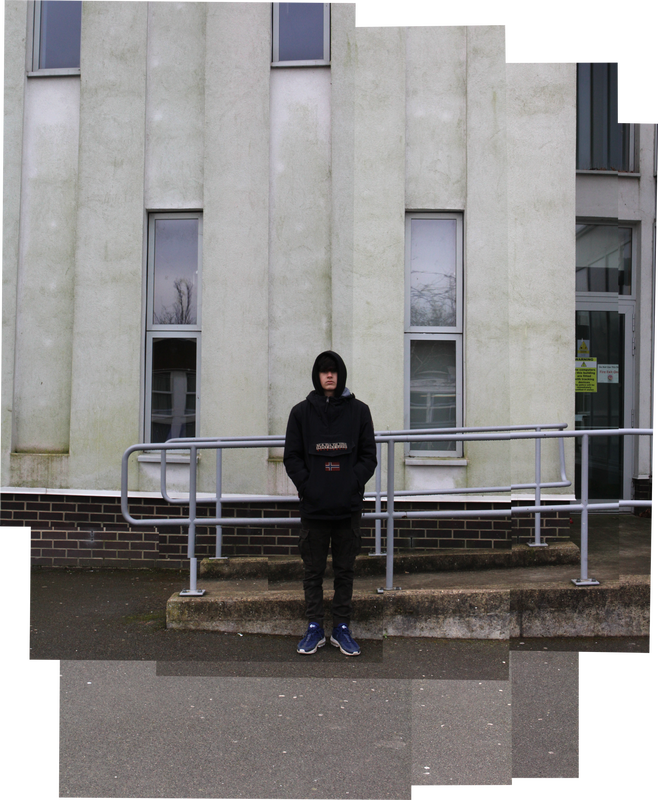
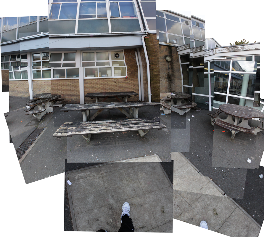
1. Chair
2. Person 3. Room |
My Response
For this task the ISO was 800 and the shutter speed at 1/60.
We propped a chair up on a table and took 9 pictures, 3 for every level for the chair (top, middle and bottom) and then brought the images into photoshop and collaged them together.
We ensured not to move too much during the photo taking and simply moved the view of the camera.
We propped a chair up on a table and took 9 pictures, 3 for every level for the chair (top, middle and bottom) and then brought the images into photoshop and collaged them together.
We ensured not to move too much during the photo taking and simply moved the view of the camera.
|
1. Choose photomerge
2. pick collage, tick blend images and upload all the files 3. make adjustments and make it look more natural 4. resize and export |
WWW: I managed to get many angles of the chair, with good lighting, focus and managed to complete all the needed steps on photoshop. I also managed to grasp the idea of David Hockney's chair
EBI: The pictures that I took were too similar and they didn't join very well, I could have spent more time putting them together and merging them properly
EBI: The pictures that I took were too similar and they didn't join very well, I could have spent more time putting them together and merging them properly
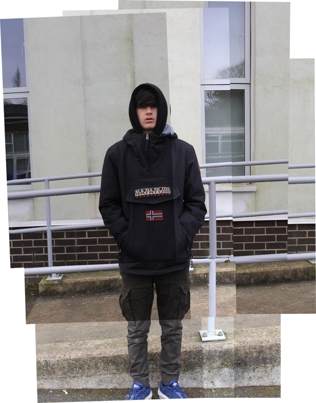
Hockney portraits
In this task we again took inspiration from David Hockney, but instead, now we recreated different photojoiners by Hockney and again put them together in photoshop
Sitting picture

|
|


Standing picture:
|
|


Standing picture from far away:
|
|


WWW: All the photos joined well, with combinations in most of them overlapping the subject multiple times, giving Hockney's idea of many different angles and focus on the whole image
EBI: in the last one, most of the actual subject was just one or two photos, instead of it being composed of many different ones as we were trying to do, also the lighting was quite different in different sections, showing that I was facing the floor too much
EBI: in the last one, most of the actual subject was just one or two photos, instead of it being composed of many different ones as we were trying to do, also the lighting was quite different in different sections, showing that I was facing the floor too much
Extension task: Hockney Room
Collage Homework


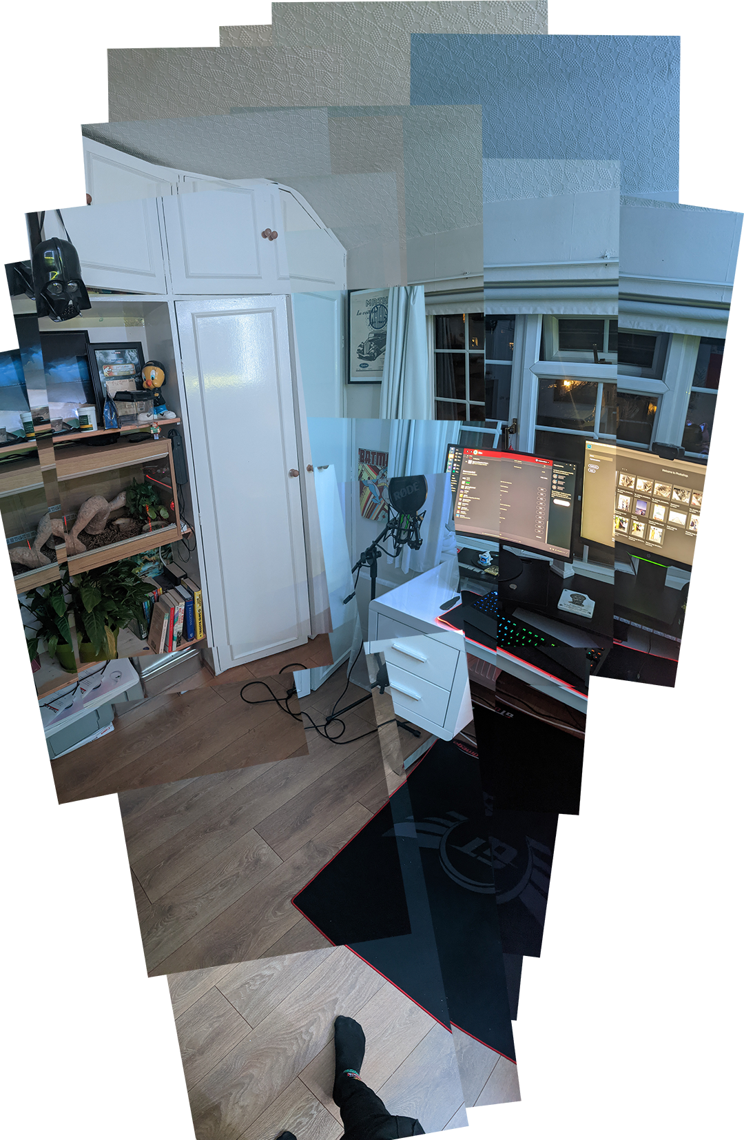
WWW: I completed the task successfully, and managed to compile the images in the same way Hockney did, interpreting his ideas into my own way
EBI: The exposure was slightly different in some of the collage images, meaning I should have spent more effort on organising my lighting
EBI: The exposure was slightly different in some of the collage images, meaning I should have spent more effort on organising my lighting
Sharon Radish
For this task we found a few items from around the classroom, and put them together in a way that was interesting to look at. To set up we put up some white card for a good background
For the process of editing I just did the basic adjusting the levels, and changing the brightness to remove any mistakes made in the photographing
For the process of editing I just did the basic adjusting the levels, and changing the brightness to remove any mistakes made in the photographing


Best Edits

|

|

|

WWW: I used interesting combinations of objects, and didn't overload the composition with too many items. I also didn't get too much background and the camera settings were all at the right levels
EBI: The shadows are very pronounced and it's obvious to see which direction the light was coming from, I could have directed it towards the sun so it was a bit less obvious
EBI: The shadows are very pronounced and it's obvious to see which direction the light was coming from, I could have directed it towards the sun so it was a bit less obvious
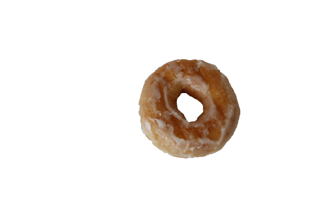
Eating sequence
In this project the goal was to document an eating sequence, a sequence where we took a picture as we ate a piece of food, every bite. The final goal was to make a gif showing it being eaten.
To do this we found a place with good lighting, set up a white card background, placed the food on a set place and made sure we remembered exactly where it was. Next we took our cameras in a set position, without a tripod (some did bird's eye view and some did from portrait view, depending on what you were eating) and slowly took bites out of the food, taking a picture after every one with both the donut and the camera in the same position.
To do this we found a place with good lighting, set up a white card background, placed the food on a set place and made sure we remembered exactly where it was. Next we took our cameras in a set position, without a tripod (some did bird's eye view and some did from portrait view, depending on what you were eating) and slowly took bites out of the food, taking a picture after every one with both the donut and the camera in the same position.
Unedited


Without background on a canvas
Editing process
|
|
1. Select the file tab
2. Select all the images you want to edit and open them 3. Select the quick select tool 4. Highlight the donut 5. Get rid of the middle part 6. Inverse the selection 7. Select the fill tool 8. Fill with white 9. Export |

WWW: The pictures were all from the same angle and zoom, which ensured that they would look natural when compiled together, and the edits kept the pictures looking natural but still improved
EBI: The donut could have filled slightly more of the picture (zoom) and the shadows could have been slightly less pronounced in the original image
EBI: The donut could have filled slightly more of the picture (zoom) and the shadows could have been slightly less pronounced in the original image
Eating Sequence Gif
WWW: I compiled them well, keeping the donut in pretty much the same place, and making sure to order them correctly
EBI: The cropping was a bit rough around the edges and the donut moved slightly to the right which could be improved
EBI: The cropping was a bit rough around the edges and the donut moved slightly to the right which could be improved
Dye in water gifs
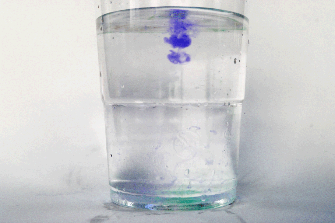

|

|
WWW: On the last gif I managed to figure out how to edit all the pictures at once so it looks more consistent than the rest, without any changes in brightness or exposure throughout. The gifs also came together well and there were no abnormalities within them. The gifs came out well and were interesting to look at.
EBI: On the first and second gif there were quite a few inconsistencies in the exposure and brightness, also I'm not sure what happened to the second one but I may have exported it wrongly. Lastly, I needed to hold down the camera button to have more photos for each gif.
EBI: On the first and second gif there were quite a few inconsistencies in the exposure and brightness, also I'm not sure what happened to the second one but I may have exported it wrongly. Lastly, I needed to hold down the camera button to have more photos for each gif.
Luke Stephenson
Luke Stephson response homework
Luke Stephson took a picture of every cornflake in a box, every single one being unique. He complied them all into a gif and it was over 4 minutes long. We made our own interpretation of this work by taking pictures of all the things from one packet of anything, I chose a packet of cashew nuts.
For the task we had to get a blank background, our phones or a camera, and a light source.
I took the images, added a levels filter and a brightness and contrast filter to make stubble changes to the images and consequent gif, turned it into a gif in photoshop through means explained in previous tasks and exported it below.


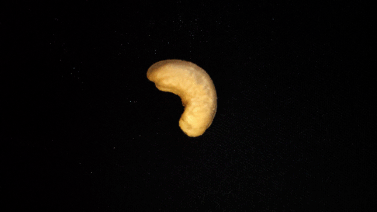
WWW: The gif was made well, with good lighting, a blank backdrop as needed and a good amount of pictures to make an interesting gif
EBI: Focus was off for some of them (can be fixed by holding the phone higher). Plus, the angle some of the cashews were facing was inconsistent.
EBI: Focus was off for some of them (can be fixed by holding the phone higher). Plus, the angle some of the cashews were facing was inconsistent.
Light and Focus
Uta Barth
|
In this project, we covered Uta Barth and her ideas of bringing to attention how we see the world around us. Her pictures often rely solely on temporary things like shadows, light and even the effect of the wind; but often bringing in techniques like taking the picture out of focus, or using a shallow depth of field.
Her photographs include simple things, and often very plain and rely completely on perception, instead of composition: the idea being to make the viewer rethink their way of sight. Barth is considering the viewing of the modern audience on pictures, only focusing on the subject, such as landscape. She prefers to revert to the basic human idea of visualisation, going back to the bare bones. She uses the phrase "The camera taught me how to see." |

|
Unedited photos


Best edits


|
|

|

|
WWW: I took pictures of a wide variety of pictures all with different and interesting objects within them. All the camera settings were well set and the focus was correct for the vast majority
EBI: I feel I could have gotten more simplistic backgrounds for some of the images, to more accentuate the shadows
EBI: I feel I could have gotten more simplistic backgrounds for some of the images, to more accentuate the shadows
Independent Development 1
 André Kertész - Fork André Kertész - Fork
For my first independent work I chose to take inspiration from André Kertész and Paul Strand.
My plan is to take a picture of something simple, with good lighting, and create interesting and artistic shadows at home, or alternatively, capture them outside and ensure that there's a simple composition with a small subject. |

Paul Strand - Unknown name
|
Unedited Photos
|
|
|
|
Final
(only the first two)

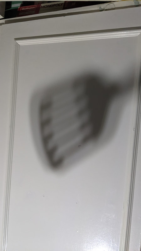
For this Image, I projected a shadow of a spatula onto my ceiling using a torch, creating both a dark outline of the actual object and another, lighter but bigger outline, making it interesting to look at. I also unfocused the shadow for effect. I edited it by changing the exposure, levels and brightness. |

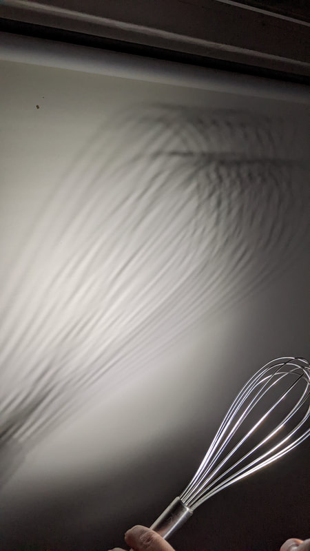
In this image, I used a torch, and projected a whisk onto my blinds, I utilised an interesting angle to make it look like a mess of lines encircling each other.
For the editing, I cut out the hand holding it, emphasised the shadows through levels, exposure and brightness. It would have been good to get the full whisk and I could have improved on that. |
WWW: I managed to interpret the ideas of the chosen photographers into my own images, separate to the topics we did in the previous tasks, I now have also have a good understanding of editing and the different tools and techniques
EBI: The Second whisk image is definitely a lot better than the spatula, I could have made another good picture and next time hopefully I can make them both to the same standard
EBI: The Second whisk image is definitely a lot better than the spatula, I could have made another good picture and next time hopefully I can make them both to the same standard

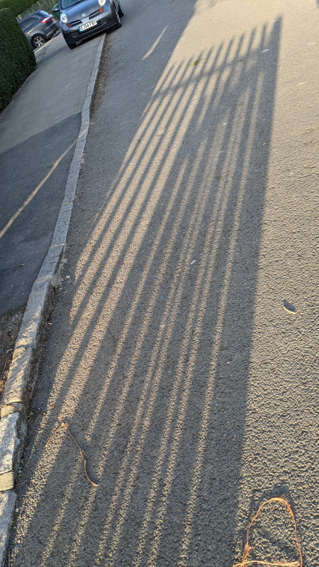
In this picture I was out just at sunset and saw an opportunity.
For edits, I used the spot healing brush again, getting rid of all the shadows other than the ones that I wanted, and therefore drawing attention only to the thing that I wanted to be seen. I also used exposure, a black and white filter on the "darker" preset. |

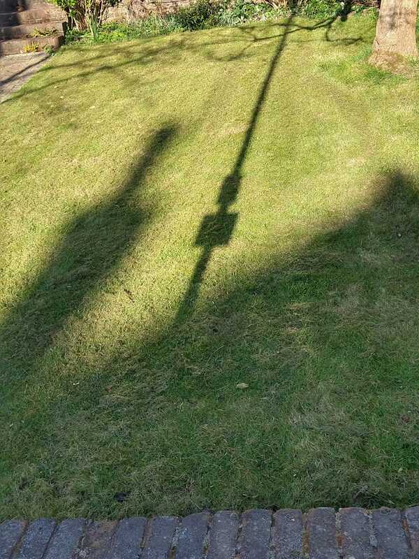
In this one, I found a shadow of a lampost and another interesting object on a garden around Muswell hill, I made sure I only got the items I wanted in the picture.
For editing, I used the spot healing brush tool to get rid of any wall or path, and emphasised the shadows using levels, exposure and brightness, I also had to crop it to get rid of unnecessary content and finally used a black and white filter on the "darker" preset. |
