Targets
Compare photographers across a project or within a piece of analysis. You could also create direct comparisons called: ‘Photographer and me” where you present a photo by you and a photo by your chosen photographer next to each other and discuss how you have been influenced.
Screen grab editing techniques.
When you take photographs, try different compositions, distances and points of focus so you have a breadth to choose from.
You don’t have to write www and ebi at the level you are. It would be far better to write a short paragraph.
Screen grab editing techniques.
When you take photographs, try different compositions, distances and points of focus so you have a breadth to choose from.
You don’t have to write www and ebi at the level you are. It would be far better to write a short paragraph.
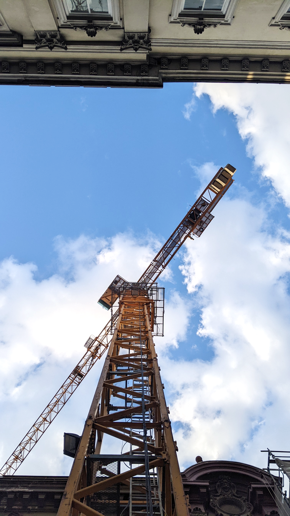
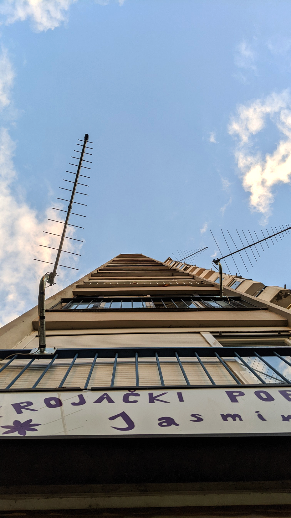
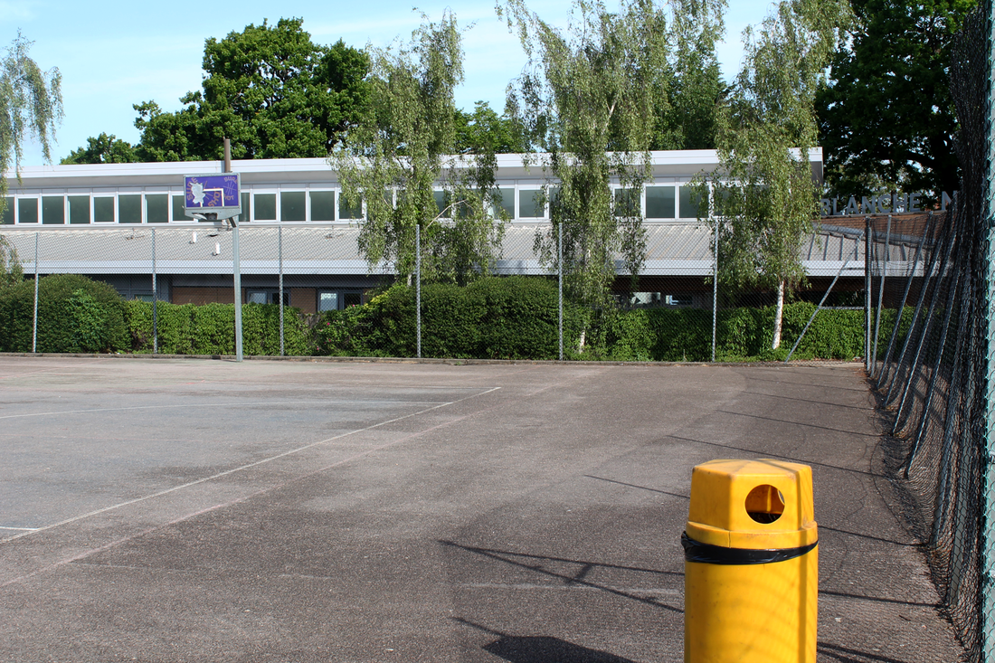
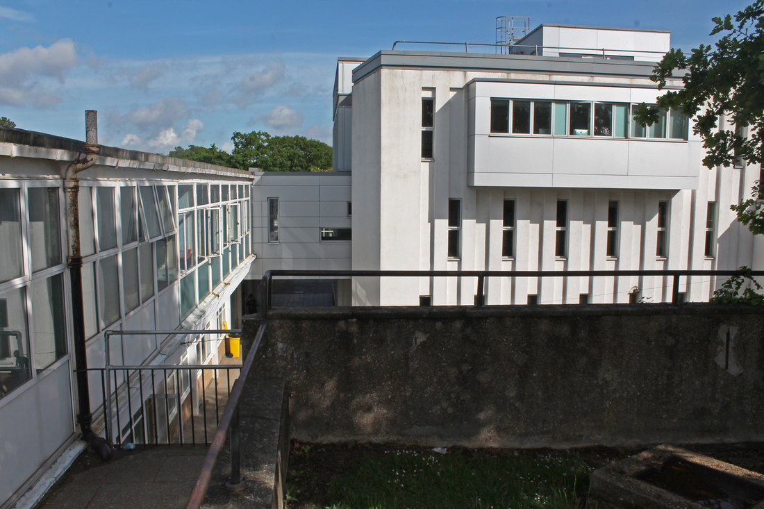
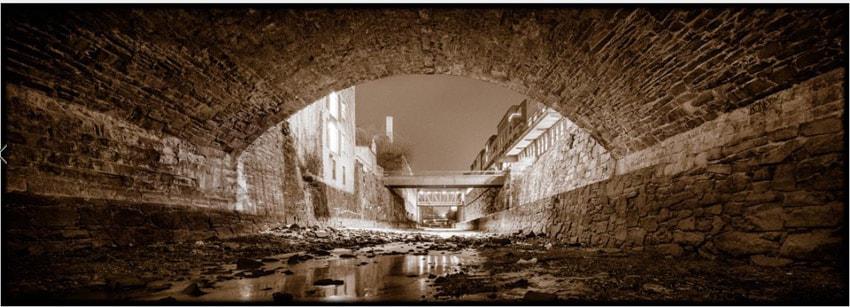
Look UP! (Easter holiday homework)
For this homework, to start off the project, we went to low vantage points, looked up at tall buildings and took a picture. we did this 20-30 times, from different angles, buildings or general surroundings, focus and angle were both very important ideas in this homework.
All the pictures I have taken are from central Zagreb, Croatia
All the pictures I have taken are from central Zagreb, Croatia


Best edits
|
|
WWW & EBI:
I completed the task, looking up and getting to good vantages and angles to clearly show my ideas. The exposure, focus and zoom is all well balanced and all my pictures clearly show the perspective. Furthermore, the sky was interesting in all the photos, with a good balance of clouds. However, I think I should have stood a bit further away from the subject to make the following editing task easier, and some of the buildings aren't to the standard of others.
I completed the task, looking up and getting to good vantages and angles to clearly show my ideas. The exposure, focus and zoom is all well balanced and all my pictures clearly show the perspective. Furthermore, the sky was interesting in all the photos, with a good balance of clouds. However, I think I should have stood a bit further away from the subject to make the following editing task easier, and some of the buildings aren't to the standard of others.
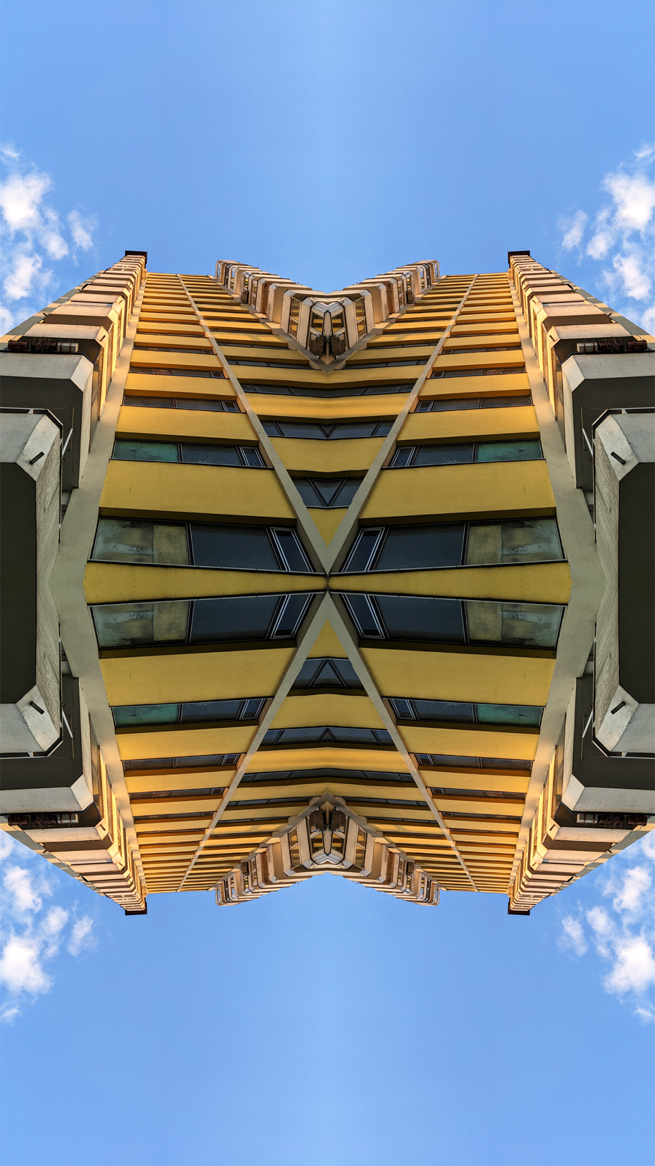
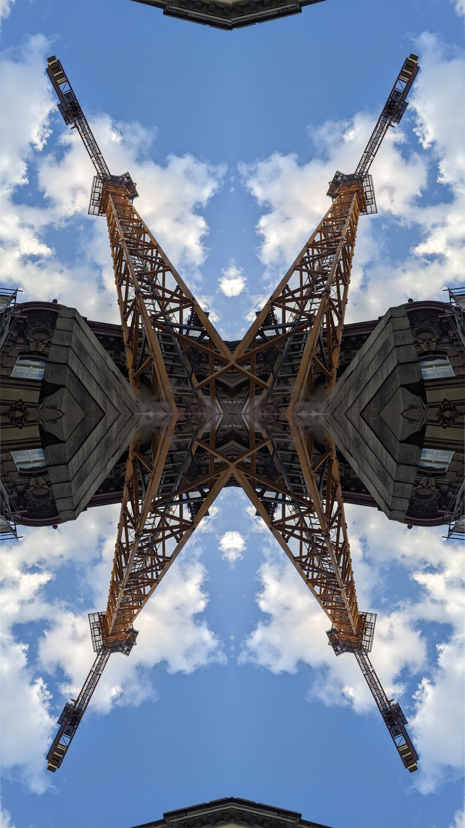
Reflecting and mirroring
In this task we had to further develop our photoshop skills, using the flipping options and duplicating to create the interesting effect seen below, we took the images from the task above to make these.

|
|

|
|
|
|
1. Opened the image I wanted to edit
2. Open the image size tab 3. Change the image size to the above 4. Open image, to adjustments and then levels 5. Adjusted the levels to what I wanted 6. Adjusted the brightness and contrast 7. Duplicate layer 8. Send the duplicate layer to an a4 document 9. ^ 10. Duplicate the layer on the new document 4 times and adjust them into a rectangle 11-14. Flip the images as needed so they all face towards the middle 15. Crop the image 16. Adjust the image size to fit 17. Export |
WWW & EBI:
I used my editing skills to create something interesting to look at and I managed to complete the task with a range of pictures. The minor edits I did were also quite affective at bringing out certain details that otherwise wouldn't be seen. However, the images I took were good but a larger range would have added more interesting variation to my edits. Finally, I could have moved a few of the pictures down a few more pixels as they are very slightly off
I used my editing skills to create something interesting to look at and I managed to complete the task with a range of pictures. The minor edits I did were also quite affective at bringing out certain details that otherwise wouldn't be seen. However, the images I took were good but a larger range would have added more interesting variation to my edits. Finally, I could have moved a few of the pictures down a few more pixels as they are very slightly off
Composition
In this task we covered composition. Composition is the way you create your photo, from what is in it to the angle, where the subject is and all the techniques used in the actual taking of the photo
Rule of thirds


|
In rule of thirds, you split the photo into 9 parts, two lines vertical and two horizontal. In general, it's much more interesting to have your subject where two lines cross, as opposed to in the middle of a square, where the eye is not automatically drawn. As seen on the right.
also, the horizon line or a wall or fence or anything with resembling a straight line should generally be put on one of the horizontal lines. |

|
Best edits


WWW&EBI:
I balanced exposure and brightness well on a sunny day, I also found good angles and expressed my ideas. However, I could have gotten more pictures and included more than one composition type in one picture
I balanced exposure and brightness well on a sunny day, I also found good angles and expressed my ideas. However, I could have gotten more pictures and included more than one composition type in one picture
Composition 2
Balancing elements
|
Knowing about the rule of thirds, it's often good to also try to balance what's in your photos. For example, if you put a large object in the left quadrant of your photo, it would be pleasing to put something of similar or equal on the right quadrant. However, keeping it asymmetrical is important in keeping the attention where you want it
|

|
Balancing edits
Layers
|
Layers can add a 3d effect to a photo, allowing the viewer to feel that they were there, and with something as grand as on the right, can feel epic.
|

|
Layers edits
Triangles
|
Triangles are often used for grouping elements in a photo. as seen on the right, it draws the eye to whatever you want to be your subject
|

|
Triangle edits
WWW & EBI
I found every composition type and captured every detail I wanted to, I also included all of the subjects that I wanted in the right sections, trying to include the rule of thirds in every picture. On the other hand, I could have included more than one type of composition in each picture, I also could have found something else for layers, as the one I found didn't include enough of the woods in the background
I found every composition type and captured every detail I wanted to, I also included all of the subjects that I wanted in the right sections, trying to include the rule of thirds in every picture. On the other hand, I could have included more than one type of composition in each picture, I also could have found something else for layers, as the one I found didn't include enough of the woods in the background
Composition Homework
For this homework we had to use the composition techniques we learned in the above task at home or around our areas.
*upload pictures below*


Best edits
WWW & EBI:
I interpreted the techniques outside of school independently, however, I resized the images incorrectly and lost a lot of the detail, in future I need to keep them in png format.
I interpreted the techniques outside of school independently, however, I resized the images incorrectly and lost a lot of the detail, in future I need to keep them in png format.
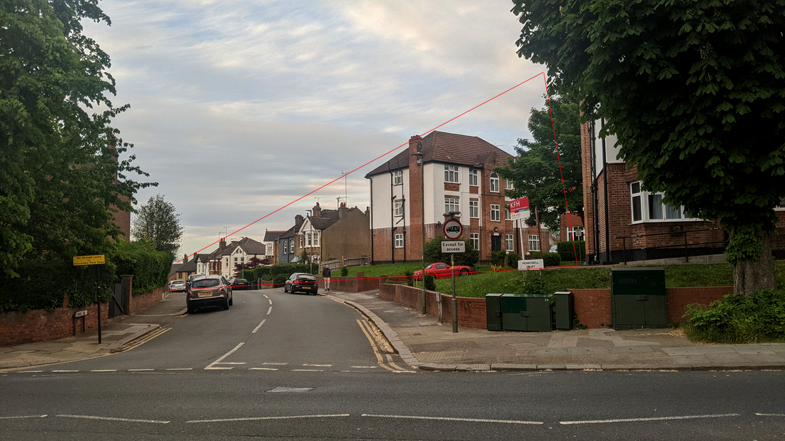
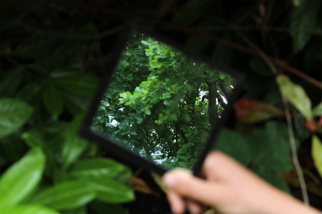
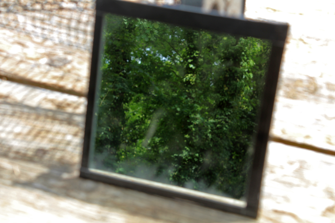
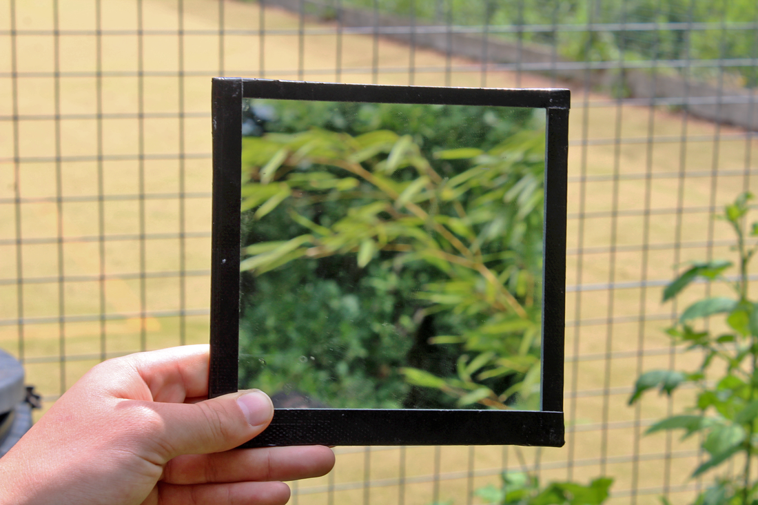
Framing
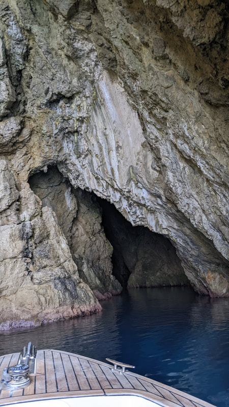
In this task we used mirrors to provide contrast, both inside and outside.
We had to be careful in making sure that the depth of field was well balanced with the exposure, which I found very difficult.
The composition was the main part of this project, however, and we needed to try and get opposites like nature vs man-made and light vs dark.
We had to be careful in making sure that the depth of field was well balanced with the exposure, which I found very difficult.
The composition was the main part of this project, however, and we needed to try and get opposites like nature vs man-made and light vs dark.
Set one


Best Edits
|
|
WWW & EBI: I successfully provided a contrary set of images, making the subject on the mirror different to the background, which was the target of the project. Higher contrast in colours and subjects could have definitely been achieved
Formal Elements Homework
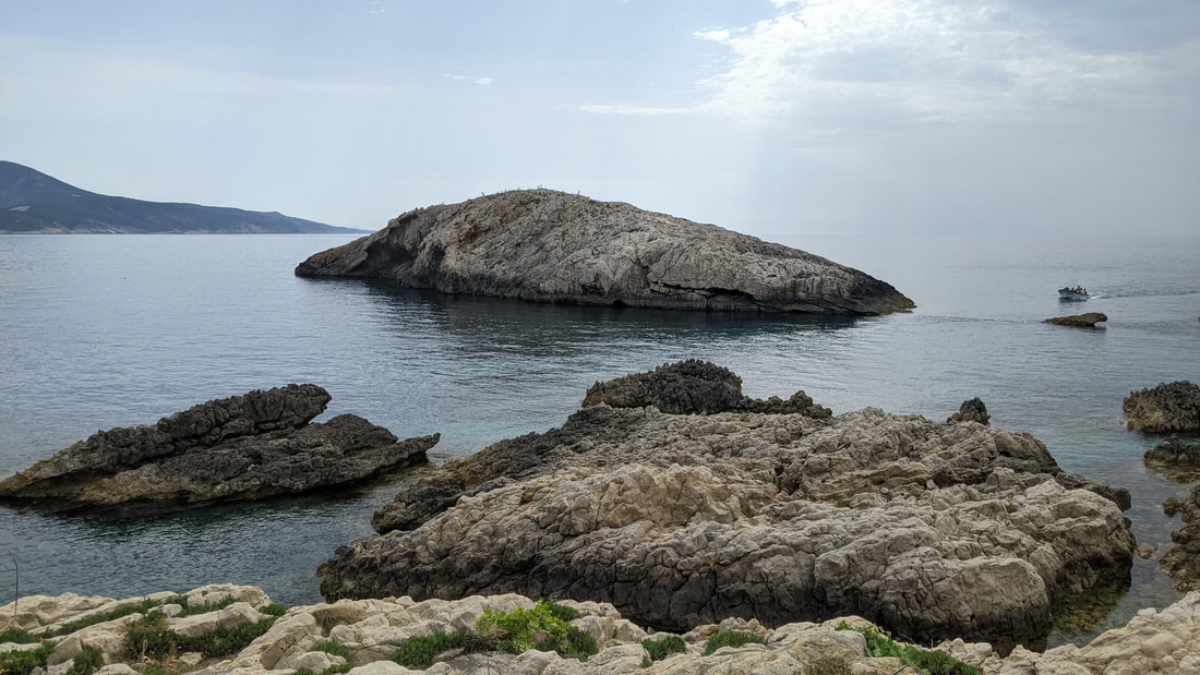
For this task we had to photograph 3 pictures of each of the seven formal elements: Line, Tone, Texture, Colour, Pattern, Contrast and Form. Most of my pictures are around the islands of Croatia, and I tried to take pictures whenever I saw the opportunity arise in my soroundings.
Line
The use of lines often seperates parts of an image, or can be the subject depending on the context, and always makes for an interesting composition.

|

|
|
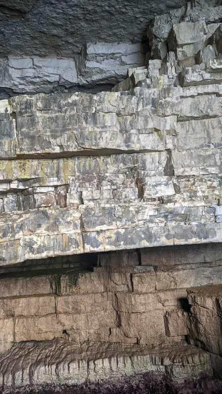
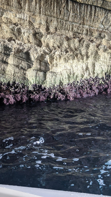
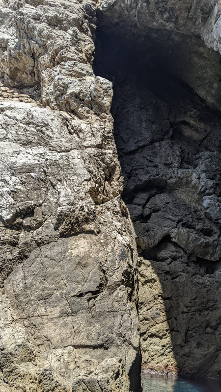
Tone
Tone is used to create contrast between different areas of an image, and create depth, especially for black and white images, because of this the original pictures may look less effective than the edits in black and white.
I chose different rocks for this as I found the sunlight's variation interesting in the different layers of rock.
I chose different rocks for this as I found the sunlight's variation interesting in the different layers of rock.
|
|
|
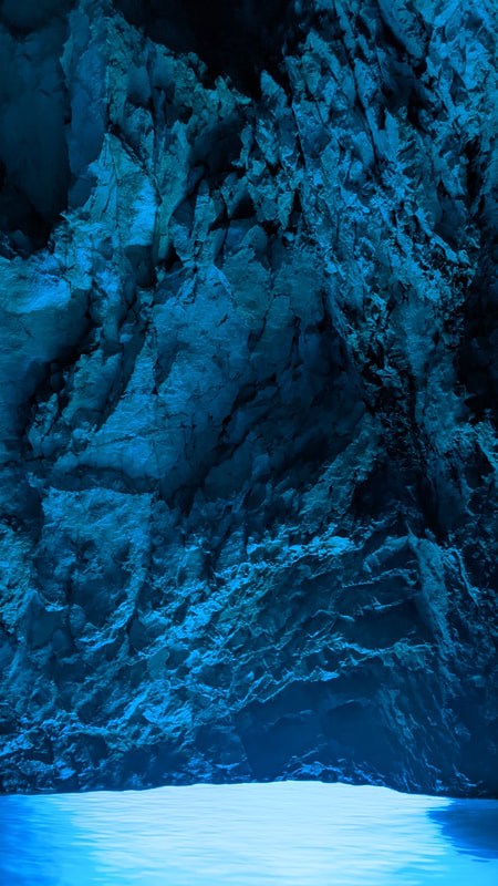
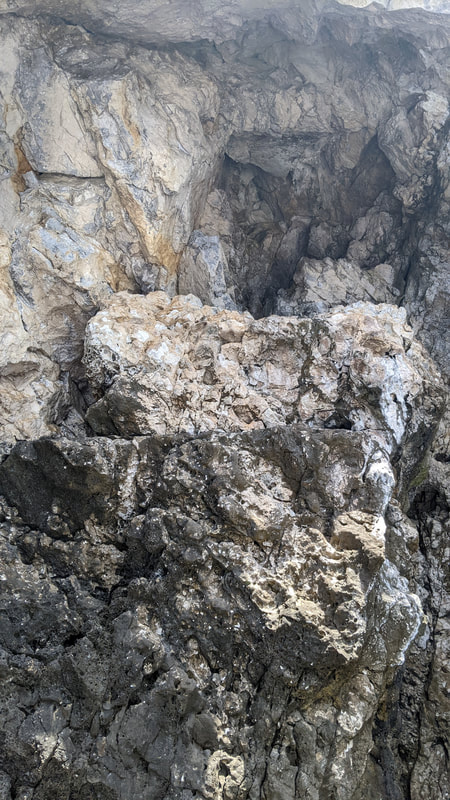
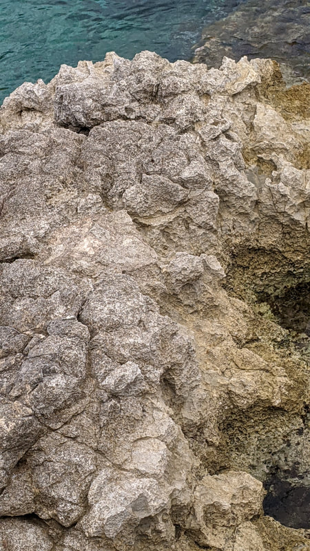
Texture
To find scenes with good texture I had to find areas that appeared "grainy" to me, often the best examples would be on the floor, but I found that the same rocks as before also worked very well in this element.
The texture on the first picture could be pulled from the line-carved upper rocks, the more rounded purple rocks near the centre of the image and the sea's ripples
The texture on the first picture could be pulled from the line-carved upper rocks, the more rounded purple rocks near the centre of the image and the sea's ripples
|

|
|
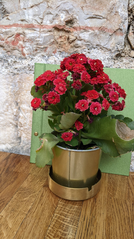
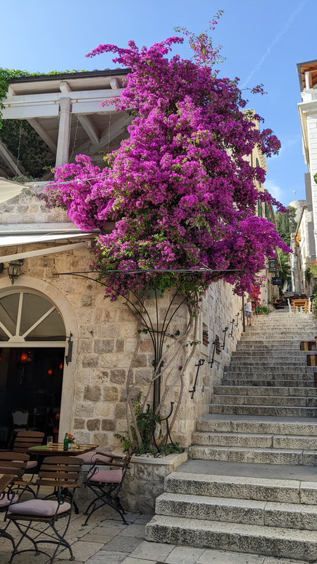
Colour
I tried to find some bright, already folourescant colours for this one, however I believe that these, like the tone pictures will do well with a bit of saturation in editing.
I think that the third picture may have been compressed from it's original quality
I think that the third picture may have been compressed from it's original quality
|
|

|
Pattern
To look for patterns in the world it was surprisingly easy, because of the nature of organisation, finding patterns in man-made areas was relatively easy, but, patterns can also be found in nature, if looked for.
(child in first picture can easily be edited out)
(child in first picture can easily be edited out)
|
|
Contrast
I enjoyed finding contrast around me, and mainly focused on dark vs light althought there are many other forms of contrast that can be found.
I had to consider what to put the third image into, because it seemed to fit so many different elements.
I had to consider what to put the third image into, because it seemed to fit so many different elements.
|
|
|
Form
I believe that form came out the best out of the seven formal elements I captured, and it was interesting to find such a 3d effect through bright sunlight that was around me.
|
|
Best Edits

|
|
WWW & EBI:
I successfully found and identified all of the seven formal elements that we covered and have confidence to use them in future work. I edited carefully, using things like tint, and camera raw filter to ensure I didn't overedit and keep them simple enough. However, I could have had slightly more vatiation in the selection of images, and in some images I missed a bit of the subject, and next time I'll make sure to get it into the shot.
I successfully found and identified all of the seven formal elements that we covered and have confidence to use them in future work. I edited carefully, using things like tint, and camera raw filter to ensure I didn't overedit and keep them simple enough. However, I could have had slightly more vatiation in the selection of images, and in some images I missed a bit of the subject, and next time I'll make sure to get it into the shot.
Beauty in Decay

|
Colin Winterbottom is an example of a photographer who find beauty in decaying things, focusing on man made objects like rust. He uses zoom to make decay, just like rust, appear like something amazing (the above resembling a lake).
We had to go around the school grounds, look for rust and get close enough to capture it into something interesting to look at. |


Best Edits
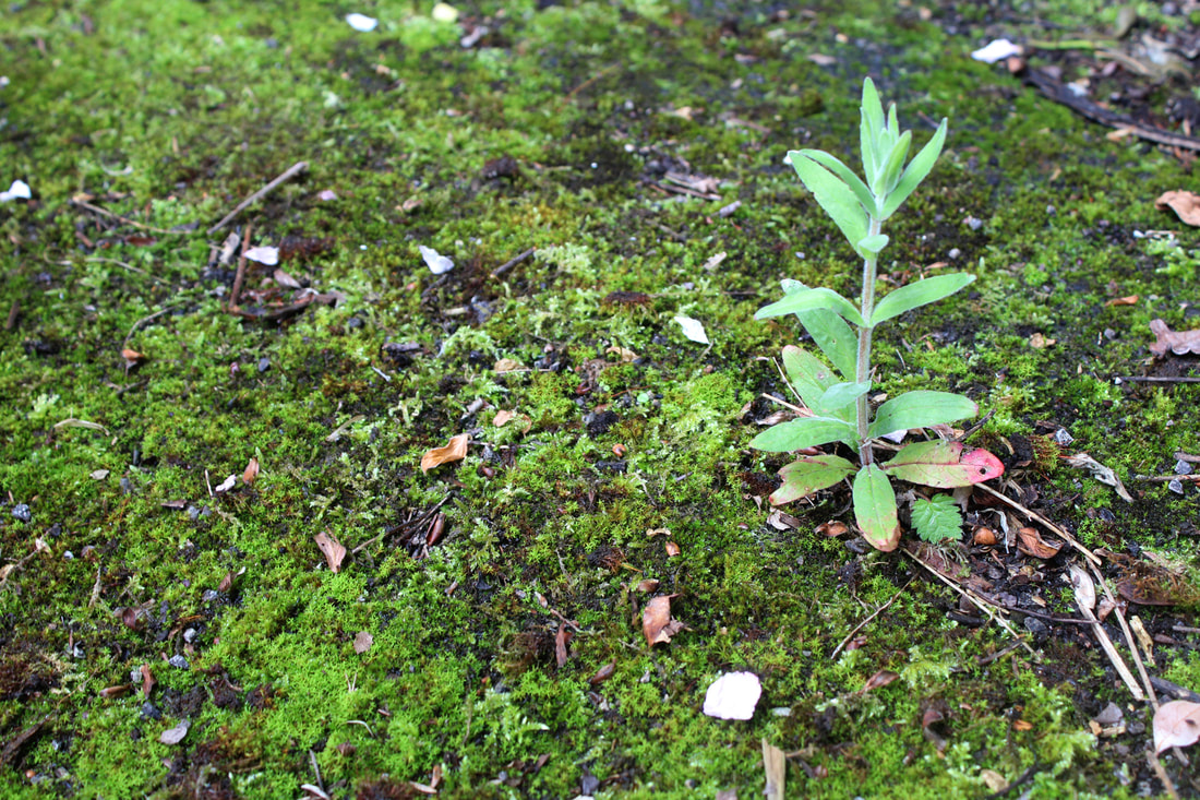
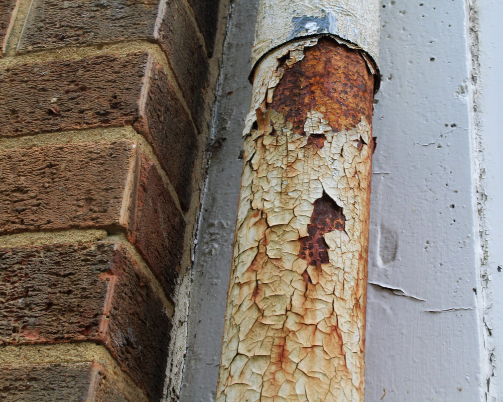
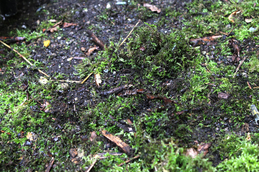
WWW: I captured the right type of pictures and I successfully zoomed in enough to make the original moss or rust look like something else that is interesting to look at.
EBI: could have improved on the actual subject matter, and the depth of field was slightly off on a few of them
EBI: could have improved on the actual subject matter, and the depth of field was slightly off on a few of them
https://youtu.be/mqpACr1Kak4
Independant Development
|
For my independant development I chose to imitate some of Petey Ulatan's work.
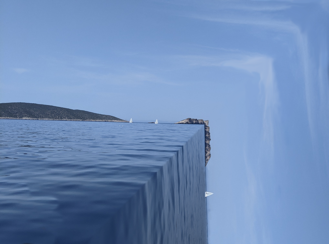
Ulatan is Japaneese photogropher, mainly posting his images on instagram, and he seems to travel the world, taking and editing pictures as he goes, judging by his collection of destinations he presents within his work Whilst researching through the project, I came across Ulatan's amazing world-bending work and how it could be used in many different landscapes, especially urban scenes, such as London. I followed a few tutorials on photoshop and ended up realising that it was possible to do myself. However, instead of doing the basic falling off the end of the world I hope to put my own twist on it, either in the shape of the bending or bending a smaller area. Petey Ulatan often uploads videos where he loops short clips of the sea, or traffic and bends the world to make it seem like the world is unnatural and that the subjects are going around an impossible corner. He does this by either: fliming from different angles the same scene, or simple bending it as I will be doing. The general focus of all of his pictures of this genre is either a busy highway or the sea, both of which are very grand, and often take a moment to fully understand the picture for that reason. |

Screenshot from a video on Ulatan's instagram in Portugal
|
First attempt
This was my first attempt at the technique used by Ulatan on photoshop
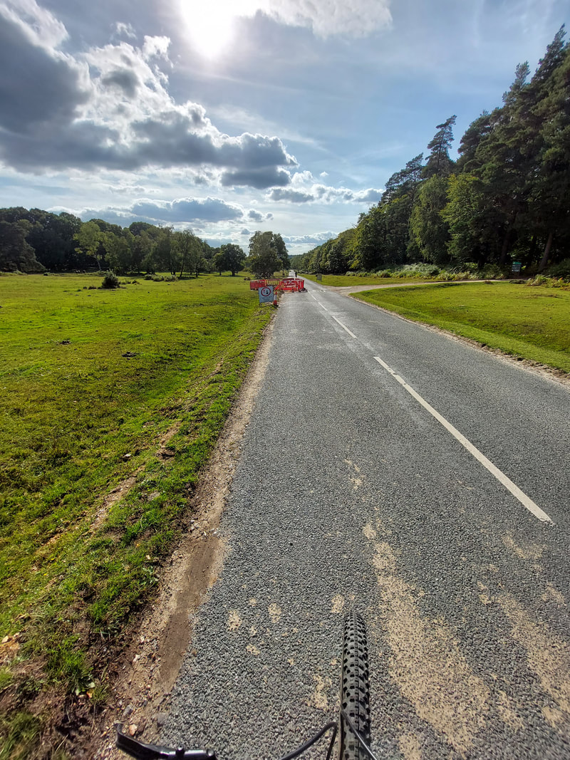
For this first edit I followed a youtube tutorial for most of it, but had to crop out a lot of the boat on the right hand side and the head on the left. I also duplicated the boats (there was only one before), terraformed more rocks and removed an island off of the bottom middle section, all in all, a successful first edit.

(Original image)
After this I went into London, to the cafe at the top of tate modern (on the southbank) and took a set of pictures of the landscape, hoping to capture one similar in essense to Ulatan's.
Below is the best one that I turned into an edit:
Below is the best one that I turned into an edit:

Mark Dorf
|
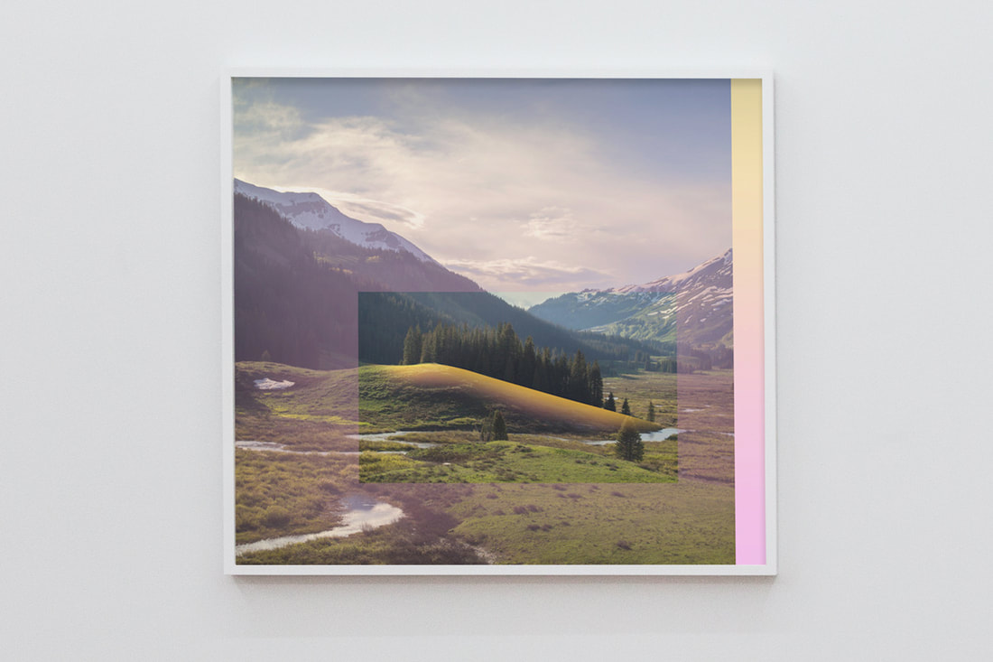
After recreating Ulatan's work, I did research on more world-bending photography artists and came across Mark Dorf.
Mark Dorf often makes geometric edits where he changes the colour scheme or landscape enough as to make it look simulated, but still very recognisable, combining futuristic, odd lighting with natural light. Below are my attempts at recreating some of his work, with the left one I tried to make a warped effect and the right I made a certain part of the image stand out by using contrast. |
|

|

|
To develop this, I considered doing an editing technique where I select the average colour from a small section repeatedely in a vast landscape: here is the result.
Original image
Editing proccess
|
I only began recording a bit over halfway into the edit because a lot was done in class. This is at 500 times speed and the real thing took about 6-7 hours altogether
|
|
Edit

Final pieces
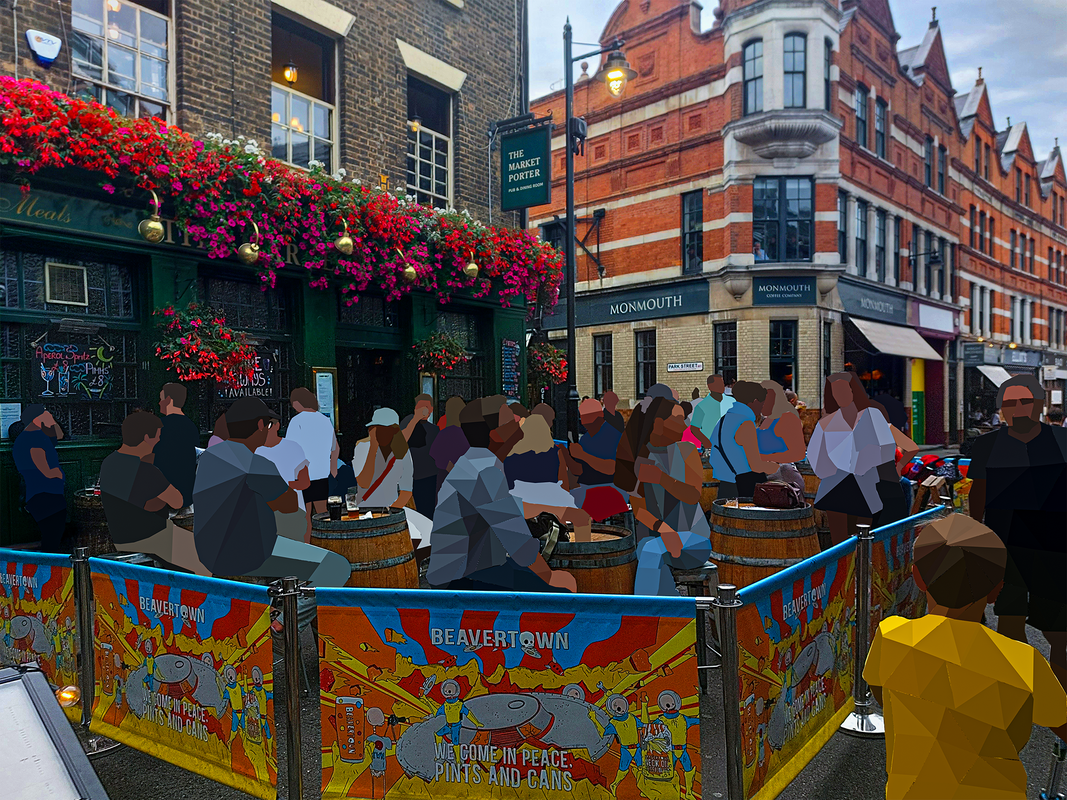
Moving on from Mark Dorf, I explored more world bending techniques, this time exploring making things look like polygons, distorting them but most of the colours remaining the same.
|
The way I edited was to select a triangle or a similar shape and average it via the blur filter on photoshop, finishing it off with a camera raw filter.
To the right is a 2 and a half hour clip compressed into 15 minutes of the editing process that went into the first piece. |
|
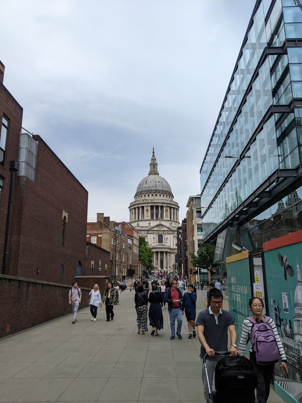
The only thing I left out in this edit is the Saint Pauls Cathedral, I did this to demonstrate that even through all the modern buildings and people, the huge religious, old buildings stay strong and prominent in London.

|
Original Image:
|
|
The editing process for this piece was the same as the last one, selecting triangles or similar small shapes and averaging their colours, this time, however, only focusing on the people and not the buildings.
|
Original image:
|
|
