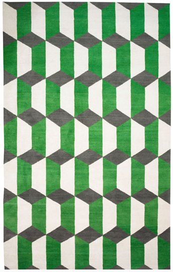
Strand 1: Vilde Rolfsen
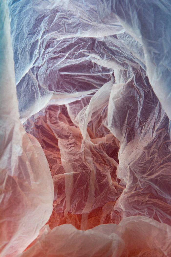
Rolfsen extracts beauty from ordinary objects, such as plastic bags, for example, we see the use of a light to create a false landscape and something of interest. She does this to raise awareness about throw-away culture. Her series "Plastic Bag Landscapes" addresses the detrimental effects of plastic waste to our land and our oceans. In my opinion, this links to change because the image of a plastic waste bag is changed into something more interesting to look at with a motive.

|

|
|
We attempted this in class with a torch and plastic bag, trying to find a dark area so we could contrast them.


Best Edits

|

|
WWW & EBI: I managed to find a good area to photograph in, getting my desired effect that I stated before. Plus, I did a good job in editing the pictures into something interesting and, in my opinion, managed to achieve something similar to Rolfsen. The project would be even better if the focus was not as accurate as I wanted it on several pictures, in the future I will avoid such close pictures and if I do end up taking similar, I will devote more attention to the focus.
Strand 2: Francesca Woodman
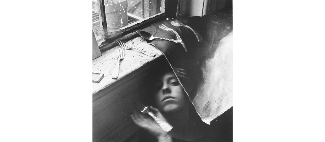
Francesca Woodman intended to make an intimate connection between viewer and image. She did this by blurring her figure and face. She wanted to create our own representation of a person and relate to our own personality.
Woodman is considering the body and the male view in this piece of work. This is shown by the only thing that is in focus being her heels, which is generally associated with female beauty and something inherently feminine.
Woodman used a plain background to create this work. This helped her to direct the viewer’s full attention to her figure and imprint the swaying picture of her, making it uncanny and uncomfortable as there is nothing else to look at. This helps her all in all to put certain ideas into the viewer’s head and make a successful picture.

|
1977-1978 - Self portrait with chair
1979 - It must be lunch now |
My idea for this is to show change as it is happening, with motion blur, as Francesca Woodman did in many of her photos. Also, similar to Woodman, I kept a certain part of the picture still, for example, a foot, to create a focus of attention in an otherwise complete blur. However, unlike her work, I am focusing on showing how fast things can change behind a mundane background, which I believe is something that we do not notice in our day to day lives.
My response


To get these pictures I used a long shutter speed to capture a lot of light, and therefore create motion blur, I had to lower the iso siginificantly to compensate for this.
Best Edits
|
For the first edit, I used the following settings on the camera raw filter:
As well as these settings, I also adjusted the light balance and cropped it. The editing process is very similar for the other edits, which, using the background that I did, creates the desired effect of a bleak area with bright movement and change. |
|

|

|

|
WWW & EBI: I managed the camera settings well, creating my desired effect and producing pictures that I desired. Also, I found a good background and took a large set of images so that quite a few were good for edits. However, I could have tried with different background, next time I will ensure I don't just focus on one area or point and expand into different places.
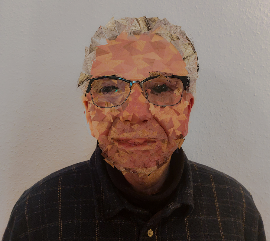
Strand 3: Gordon Magnin
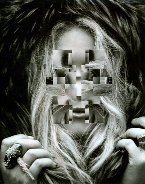
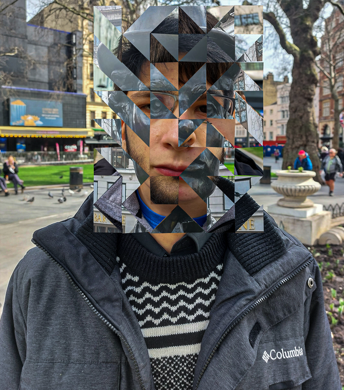
Magnin is an artist and photographer who manipulates faces (mainly from women's magizines) by cutting geometric shapes (triangles, circles, squares) and rotating, flipping or morphing them. The aim of this most of the time is to create an uncanny image that is often distrubing due to the sense of the image staring at the viewer, as we can see in the example given.
|
|
My response
I tried to keep my unedited photos very basic and simple, instead more focusing on the editing which is the largest part in the ideas. I used a variety of facial expressions and a few angles to give myself a range to work with


Best edits
WWW & EBI: I achieved a result using the same methods as my target artist, emphasising the eyes (which was one of my focuses) and didn't over-edit the picture as to give it the slightly uncanny feel that Magnin achieved. But, one thing I struglled with was making the background similar to Magnin's supernatural ideas.
Development 1
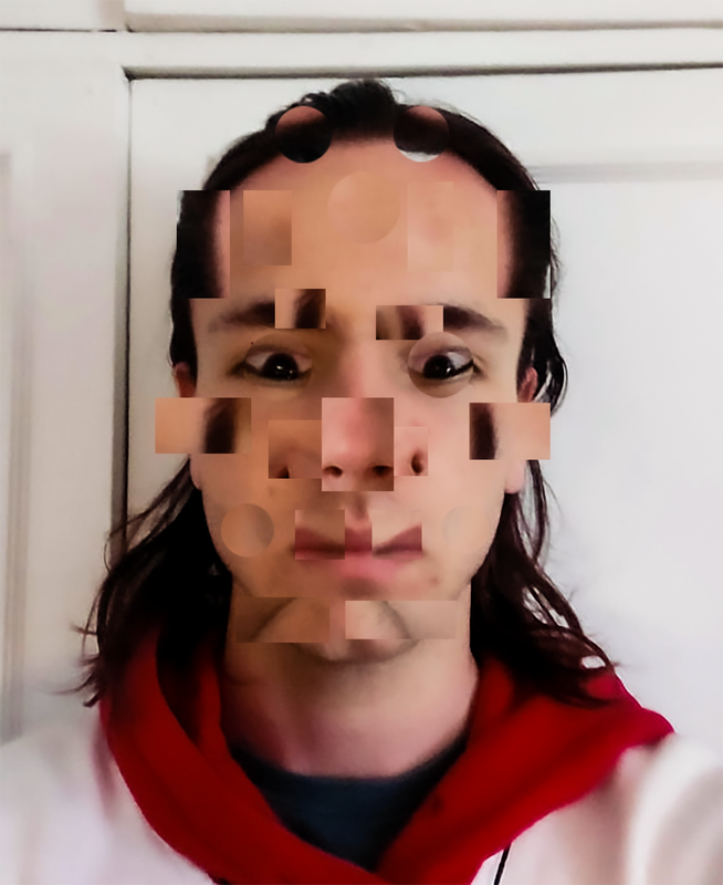
My preferred strand was Gordon Magnin because I really like to do photography edits. I also feel that this strand expresses an idea that I hold interest in, the idea of someone or something looking uncanny due to editing. Furthermore, in my opinon, editing is one of my fortes in photography and choosing this strand could lead me to do something more that I am genuinely interested in and am given creative freedom in.
In this development I decided to select small parts of a face and drag them into different areas, keeping the general colours and shape in the hope of making something somewhat alike a face but too strange to be one.
In this development I decided to select small parts of a face and drag them into different areas, keeping the general colours and shape in the hope of making something somewhat alike a face but too strange to be one.


WWW & EBI:
My editing was good and I completed my goal of keeping the shape, features and general colour of the original face. However, I do think that the overall desired result could have been a bit more aesthetic, but I believe this is because of the original shape of the face, next time I will get more than one face to edit.
My editing was good and I completed my goal of keeping the shape, features and general colour of the original face. However, I do think that the overall desired result could have been a bit more aesthetic, but I believe this is because of the original shape of the face, next time I will get more than one face to edit.
I then thought to try a similar thing, except this time I simply rotated square sections of a photo in a grid. I thought that maybe this would create a more interesting and better toned edit.
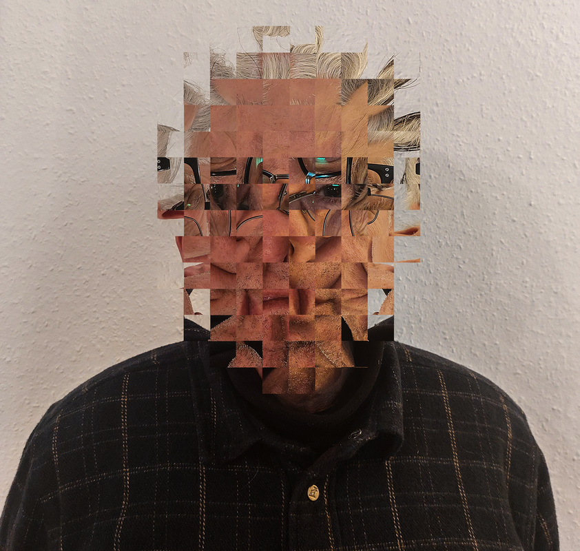
At this point I felt like the attention was only diverted, so I tried to flip the 4 squares that contained the eyes below.
This gave me a much more uncanny feel as the eyes remained the same whilst the rest of the image was very different
This gave me a much more uncanny feel as the eyes remained the same whilst the rest of the image was very different

WWW & EBI:
This edit came out a lot better, keeping the sembelance of a face to a much larger extent and achieving the goal of being uncanny by diverting a lot of the attention to the eyes and giving the viewer a sense of confusion, but also uneasiness. I felt though that I could develop this further if I had multiple faces and tried to combine them.
This edit came out a lot better, keeping the sembelance of a face to a much larger extent and achieving the goal of being uncanny by diverting a lot of the attention to the eyes and giving the viewer a sense of confusion, but also uneasiness. I felt though that I could develop this further if I had multiple faces and tried to combine them.
Development 2
Lucas Simoes
Lucas Simoes is a photographer who physically cuts out and changes patterns in a photo. His works often focus on faces and making them look unnatural and distorted. I liked this idea and decided to try and find a pattern off the internet and try combining two faces using it. This shows change in people and by making it look still somewhat realistic at first glance, in my opinion, it shows how despite race and appearance, people are very similar with just a slightly different outlook


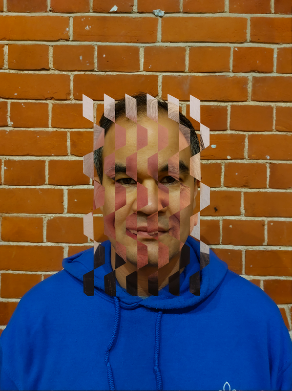
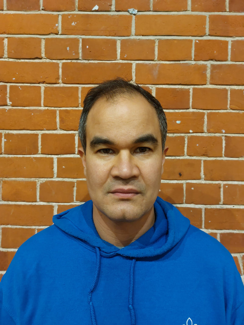
To do this edit, I opened both the images in photoshop and used the skew and adjustment tools to line up the faces properly. I then layered the pattern over the two images and cut out only the green parts of the top layer, this resulted in an effective picture that combines two faces fluidly in a way that doesn't like extremely unnatural. In my opinion, keeping the eyes normal is essential to keep the image realistic and not doing so sometimes ruins and edit.
I reused a picture from the last development as I thought it lined up better than the ones I took for this one.
I did not create the pattern, I found it online.
I reused a picture from the last development as I thought it lined up better than the ones I took for this one.
I did not create the pattern, I found it online.
Pictures used in above edit
|

|
|
WWW & EBI: I managed to line up the faces well and create a weird and uncanny result. The edits were also uniform and kept in a pattern. However, I feel as though combining more than two images would be more interesting and I hope to do that in my next development.
Development 3
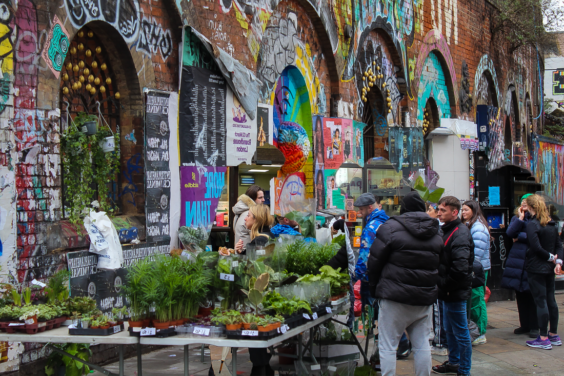
I then continued this idea but instead of just editing faces, I asked people in an area (the area chosen was Leicester square) to take a picture of them and also used something from the area around, a statue. In doing so, I capture the essence of the area and stay on my theme of editing faces using patterns. This instead shows the difference (change) in people in a certain area.


|

|

|
|
WWW & EBI: I created an edit that managed to not change the face shapes of the people and keep them similar so as to have a seamless edit. The result was better than I thought and it's hard to tell who the body actually belongs to, which means that I managed to create a combination well. I do think however that it's hard to demonstrate any more change through faces and in future developments I'd like to focus more on places more.
Development 4
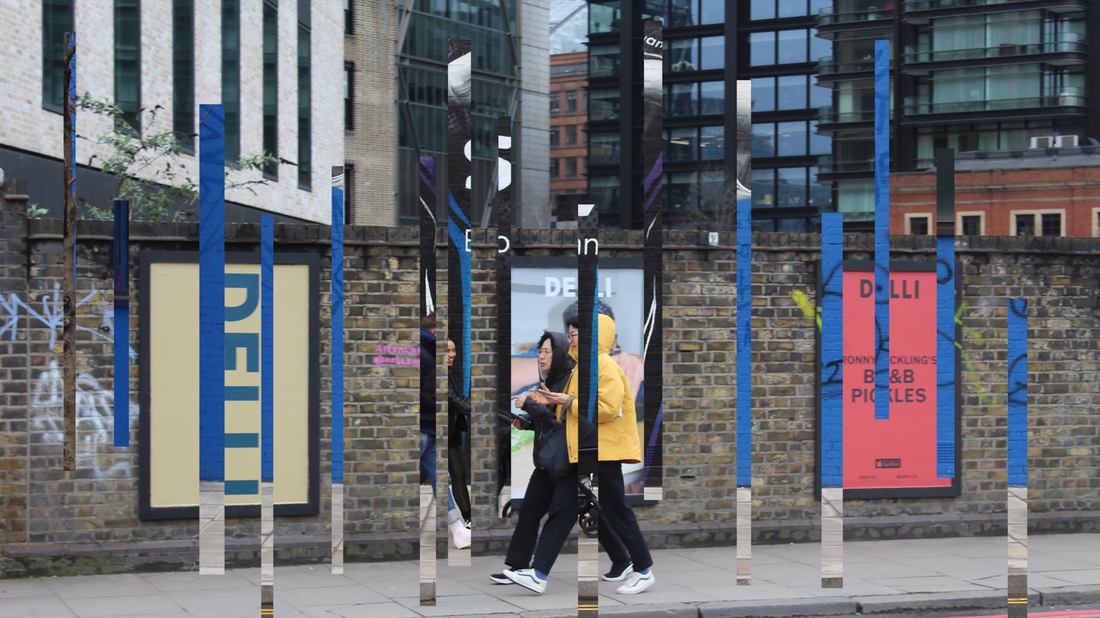
Keeping on the theme of representing an area, I chose to take inspiration from Daniel Crooks, who is a sculptor and a photographer who focuses predominantly on time-based work. He will frequently take multiple pictures of a setting or area and edit them together or edit parts of them warped into one another.
I found his work very interesting and decided to take a shot at replicating one of his works so I decided to represent the change in people in different parts of an area like a plant shop vs a bagel shop or different passages.
I hope to create something alike to his creation by taking a picture of Central London and editing it to create a look into the other place and sort of show the change and differences throughout an area.


Edits
For this edit I tried to make the cuttings look like a wave, which turned out ok but I wanted something more original as the photos I had taken, in my opinion more fit other pictures from Daniel Crooks
Process
I decided to change the editing process this time and instead tried cutting out all of the people waiting in queue and putting a picture of people waiting in a different queue behind it.
Process
WWW & EBI:
I achieved an interesting picture that makes the viewer look twice to fully understand it. I also successfully used a DSLR camera without any exposure or colour problems. However, I would have liked to get more people in a picture, and therefore created a more packed environment.
I achieved an interesting picture that makes the viewer look twice to fully understand it. I also successfully used a DSLR camera without any exposure or colour problems. However, I would have liked to get more people in a picture, and therefore created a more packed environment.
Development 5
|
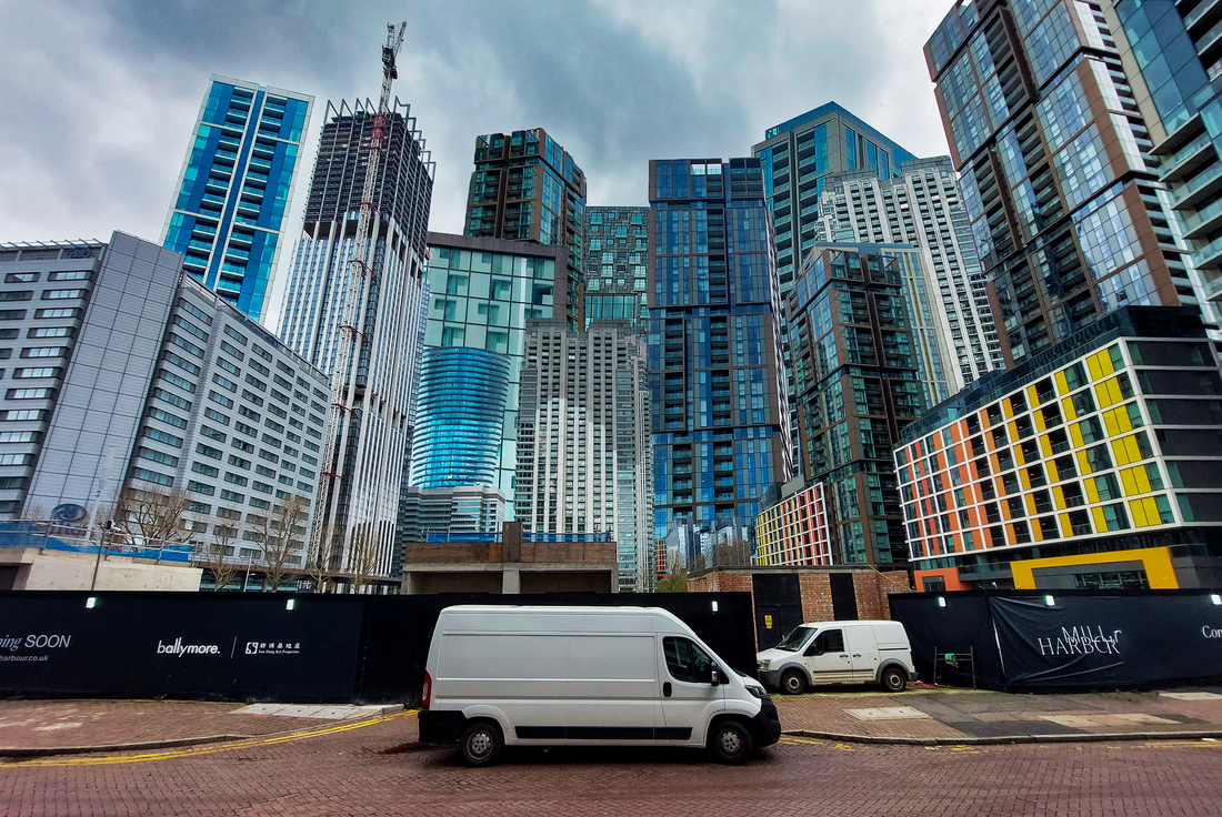
Moving on from this idea of looking at an area, I decided to focus on just the buildings in an area. The photographer I am using, andreas Gursky looks at urban landscapes and duplicates or extends buildings to make it seem like there are more than there already are, creating an illusion of extremely high density enviournment and brings to the reader an almost dystopian image
I hoped to represent the change that goes on in urban areas from over population by adding many more buildings to show what the area could look like if it were completely used for housing/buildings and show what our areas could turn into with enough industrialisation. |
|


First attempt
Original Image

Edit
I then decided to try out an outer glow effect on this image and see if it would work and added a few more buildings.
I really liked this effect and decided to carry on using it in my next edits, this edit turned out a lot better than expected with the picture I chose, I succesfully created a sense of overcrowding in an area via the use of duplication and extension whilst still making it look realistic and not extremely obviously edited.
Second attempt

Third attempt
On this attempt I tried to incorprate a few buildings from other photos and made a siginifcant amount more buildings than the last edit to enhance the prievious effects of making the area seem overcrowded. I also reused the outer glow idea to highlight the buildings from the grey backdrop and a give a realistic but at the same time surreal arua to the scene.
Original image

Process
To edit this I selected different buildings and duplicated them, then I adjusted them with the transform, warp, perspective, skew and the graph tool to make it fit in well. I had a problem in the end where photoshop crashed without saving my work but thankfully it recovered it, this did mean I couldn't edit the middle colourful building as well as I would have wanted to though, despite this, I am very happy with the outcome.
To finish I used a camera raw filter and added an outer glow as stated just above.
To finish I used a camera raw filter and added an outer glow as stated just above.
WWW & EBI: I achieved a high degree of interesting edits. I turned relatively empty pictures with a lot of background into interesting, packed and dense areas, whilst still keeping a realistic element. I also managed to create looming structures in my last images. One thing I would improve on is a wider choice of buildings. In my next development I think it would be better to focus on less images.
Final Development
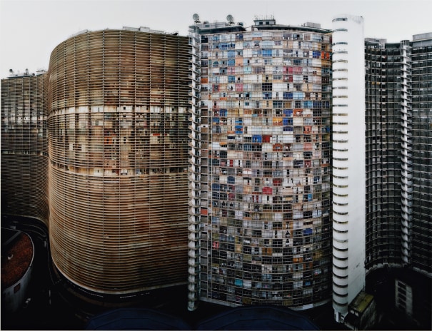
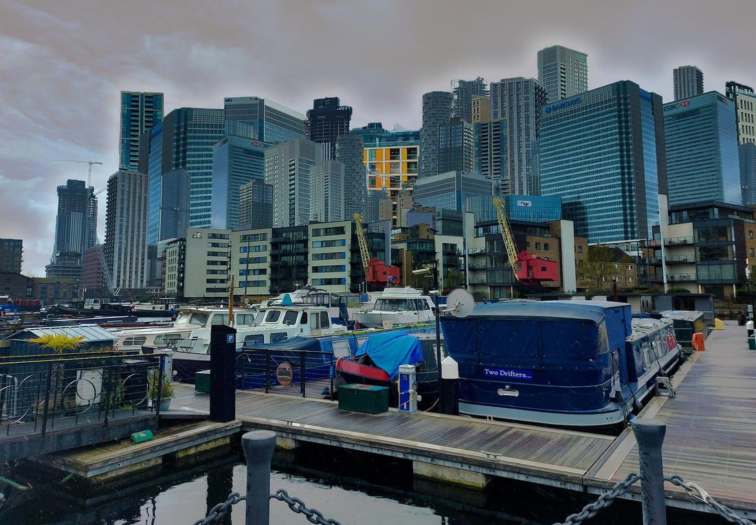
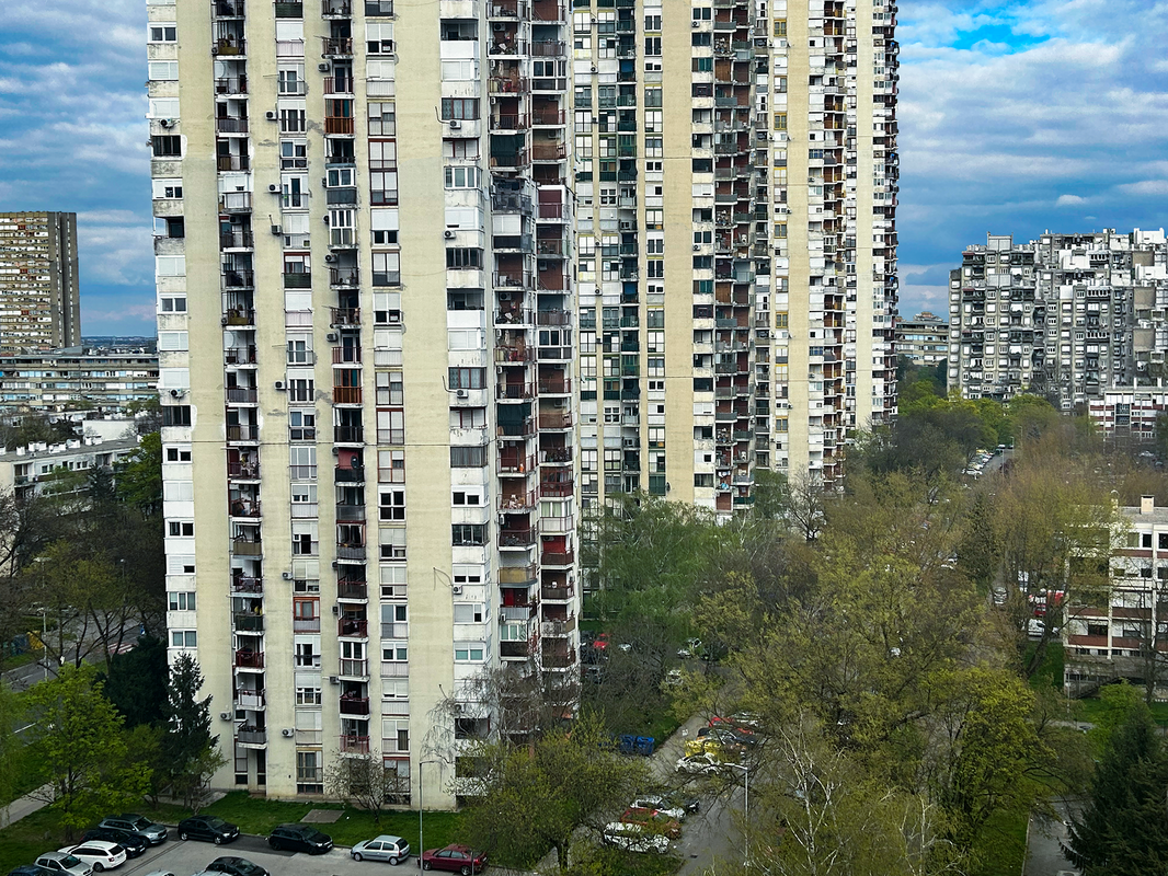
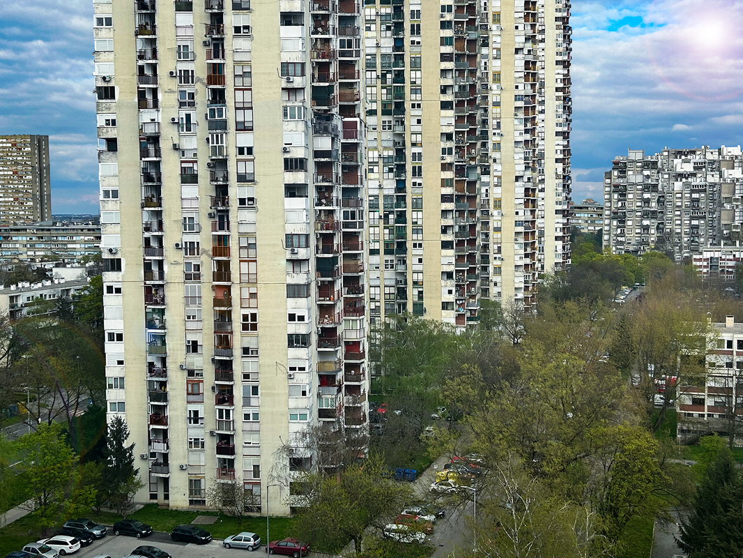
For my final development I kept on the idea of duplicating buildings but this time took inspiration from Michael Wolf. Michael Wolf is a photographer who mainly focused on very high density population areas in Tokyo, he emphasised these conditions by cropping just a large building with no background, implying there's nothing around except building and creating a dystopian sense. He also duplicated buildings to create more obvious crowding and population problems.
|
|
Whilst looking at his work, I made strong connections to the area in Zagreb, Croatia that I am very familiar with, "Novi Zagreb" or New Zagreb. This area was built during the Yugoslavian communist era and was made with primarily practicality in mind, creating an almost dystopian derelict feel. I went to one of the biggest blocks of flats in the world (it was in this area) and around it, photographing it and edited them in a similar style to Michael Wolf.
My goal was, similarly to the previous development, to show how overpopulation causes a dystopian sense in an area by editing buildings that had been made completely with practically in mind without much regard for look. This area has these buildings because they were made to withstand earthquakes and to house many people comfortably, but to someone looking from the outside it seems almost hellish and looming how so many people are packed so close together.
My goal was, similarly to the previous development, to show how overpopulation causes a dystopian sense in an area by editing buildings that had been made completely with practically in mind without much regard for look. This area has these buildings because they were made to withstand earthquakes and to house many people comfortably, but to someone looking from the outside it seems almost hellish and looming how so many people are packed so close together.


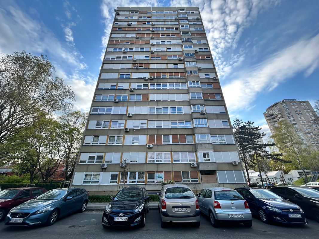
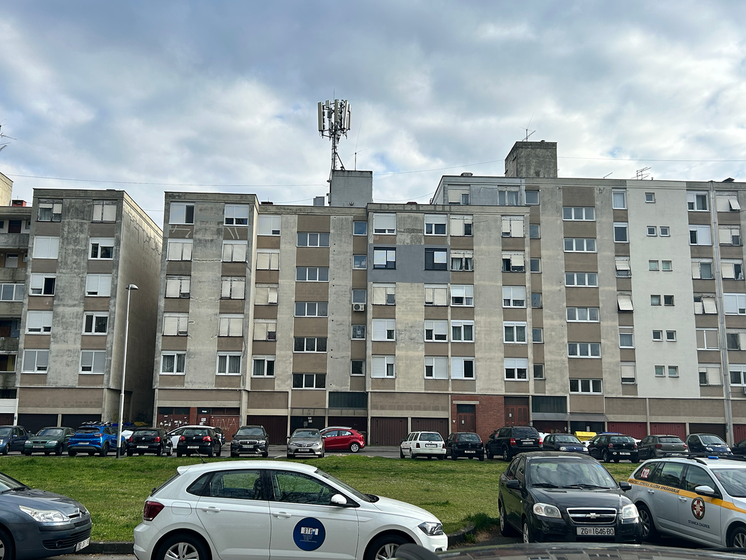
My edits
Process
I didn't like the result from this edit and so decided that for my final pieces I would include less of the background and focus on just one building
Final Pieces


|
|
To create these edits, I selected the buildings around individually and duplicated them, adjusted them and ensured that they were all connected properly using the brush, clone stamp, perspective, skew, rubber, levels, other adjustments and other tools. I then cropped it and made sure it was as straight as possible. I also made sure not to use any other pictures and utilise just the assets within this image.

Original image

Process
WWW: I am happy with the final result, I believe that I achieved an artistic interpretation of the style of buildings in the area and created an impressive piece of art. I managed to withhold and balance the exposure, brightness and contrast whilst still creating complex edits and keeping an element of realism.
